Archive | Art RSS feed for this section

Art Review: Ikenobo Yuki by Virginia Poundstone

10 Oct

ikenobo yuki


Virginia Poundstone plays with mixed media that combines the natural with the unnatural in strange ways.  One thing this piece doesn’t show is that this is about counter height which is much more impressive than this image (which makes it seem about palm-sized) belies.

Yuki Ikenobo, in real life, is a headmaster of a holy order of flower arranging.   I’m not about to get into all the details about it, but it’s at least five hundred years old, and in a recent interview Ikenobo talked about bringing their arrangements (which are beautiful) to reflect modern tastes.    I find this idea perplexingly odd–I mean to me a religious order would create something that wouldn’t cater to human fashion.   However, since flower arrangements are always temporary I suppose change is part of their nature.  Another thing: Ikenobo means “to bring flowers to life.”

Poundstone’s flower arrangement is NOT temporary–it’s a big print glued to a stone wall.   More of the print turns to ribbons on the top, vaguely set in an organic arrangement.   What’s interesting is that it has all the trademarks of flower arrangement, with none of the naturalness of one.    Aren’t the ribbons in a sort of flower arranging shape?  Isn’t the image of flowers?  Isn’t this purposely arranged?   Why does it look more like a radio than a bouquet?

And what’s striking is this sculpture is just as much “alive” as a flower arrangement—after all, flowers usually are dead, and this is an image of living plants.     Yes, I can hear you say, but this isn’t it–this doesn’t bring flowers to life.

And yes, I say, you are right, but isn’t this how many people experience nature?   In fact how many people seem to want it to be?  Here there will be no rotting, it’s set at a comfortable ratio.  It certainly could be useful–I mean the counter could hold things if you like, or be a greeting counter for a bored desk worker at a posh hotel or something.    Isn’t it nice and safe, like looking at something through a computer screen?   Everything set in very stable looking blocks.

And that’s the thought here–the thought of permanence vs. impermanence.   How fickle our idea of beauty is–and how our idea of “natural” vs. “unnatural” is completely imaginary.  After all, a bouquet is a completely unnatural arrangement of flowers that looks good because we’ve been taught to expect certain things from a bouquet.    Heck, half the time bouquets have flowers that would never grow together.

Wow, Poundstone certainly knows how to pack a concept.   This is the art that I like–that which communicates something–and of course Poundstone is not just talking about flower arranging, but the place of all art.   What is it for?   What’s interesting about both art and humankind is they are the only two things in this universe that has to spend an inordinate amount of time justifying their existences.   Why is that?

What I would like to think is that Poundstone read the same article that I did and thought “you want a modern flower arrangement, here’s a modern arrangement for you.”

Art Review–Q Confucius by Zheng Huan

18 Sep

zhan-huan_2


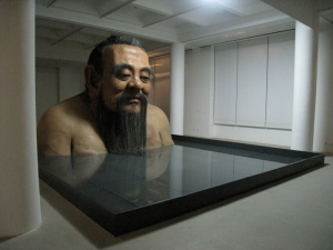
It’s hard to tell in this image, but this sculpture of Confucius is way bigger than a human being, demanding the viewer to look up and be shrunk in comparison.    There’s something of this image that strikes me–partially because of his benign expression,   he truly comes off as Buddah-like.    Also all of the trappings that would have marked him from a bygone era are stripped away making him look almost shockingly modern.  He really wouldn’t look out of place in modern society.

The sculpture really creates a sense of humility and joy just by being in its presence–a great benevolent personality looking at us like we are mildly amusing, but also gently.   And oh how human he looks, you can see the creases of his ears and his flesh seems palpable.   It’s a far cry from the stone images of religious figures we normally get.

What’s brilliant here is that Confucius becomes his own symbol–he was never about reaching Nirvana, or getting beyond life–he was about a well ordered society and a well ordered life, nothing more.   Such simple ambition was/is revolutionary–it’s what allowed such a massive country as China to be able to function as a society and a culture.

And then there’s the ambiguity–is he bathing, or is he sinking?   He seems to be at rest, but the water-line is a little to high, we do not see his arms–is he stuck?  And following this frame of thinking, how do old traditions fit into the modern world?  Are we so full of pride that we think that beliefs that have existed for thousands of years through endless cycles of change are suddenly defunct just because we have computers and cars and advertising?  Are these common things enough to unwind Confucius’s common-sense wisdom.

Perhaps this is why Confucius is smiling.  He knows better than that.  Yes the trappings of life may have changed, but humans are essentially the same as they always were, and the ways for a stable life have not altered one iota.

Art Review, Richard Segalman, Six Dancers

5 Jun

Six Dancers

Segalman is a very classic American artist–he is not very interested in pushing visual language forward in some sort of abstract way, nor does he go for social situations, yet there is something that draws me to his art–you could say it’s nostalgic, many of the paintings seem to be from a not current time, though what time it could be you can’t put your finger on either.  Many of his paintings have to do with groups of people and the sea–this was one of the few ones that didn’t so maybe this is why it stuck out for me.

What we see are three couples all dancing in a line, probably in some dancing class.  The dress is nice but casual, and the room is completely empty (it doesn’t look like a high school dance for example.)  It’s funny, but for a good amount of people learning to dance has replaced actually going out dancing, which I find amusing because they often learn dances that nobody really does in any dance hall that I know of.  Can you still go out and foxtrot?

The pairings are intimate and awkward–the couple on the left in particular seem like they’re looking around for direction.  The couple in the center seem a little more certain and the last couple is surer still.  It looks like a progression almost, because the people get lost into dancing.  Notice how all the men have both feet flat on the floor while two of the women are dancing around them.  The center couple seems the most intimate–standing the closest together, the woman’s legs moving in a different direction than her body–even though the couple at the right seem better dancers maybe, their bodies are farther apart, and that teapot pair of arms sticking out make it seem mannered rather than passionate.

An interesting work, a work that is pleasant at the same time as rewarding scrutiny.

Art Review, Enrique Castro-Cid, Yellow Contortion

22 May

Castro-Cid2100180t


One of the things that can drive me crazy when I talk to people about art is people who don’t know the difference between pretty things to hang on the wall and capital A Art.  To them a painting like this one would be more than pointless, it’s neither pretty, ignorable, nor meant to be part of a design.  What we get are two figures that look trapped in amber, their bodies all distorted and frozen.  or maybe if you took people and pressed them flat in a book, they’d look like this.

Disjointed, distortion are what Enrique Castro-Cid–and when looking at this, don’t you sometimes feel trapped and stretched out of shape from time to time?  What makes you feel this way?  Well, one explanation would be society, which demands that individuals change their shape to fit its needs.  The two figures seem to take this in different ways–the figure on the left seems to want to beat himself out of the painting, his arms flexed aggressively, the woman on the right looks to heaven in a pleading gesture.  In the meantime the yellow space around them is all scratched on, showing the white background peeking through.  That’s the odd thing about the yellow field–it seems to be the thing that traps them, but it’s also what gives them shape and definition.

In a way that yellow field seems to be shrinking and breaking down, and when that is gone, will the figures show up at all?  After all, they are largely made up of white (though they do have black outlines.)  Will they be less distorted, or more?  Can they function off the yellow field?

A very interesting painting, indeed.

Art Review, Guy Allison, Why the Angel Jumps

15 May

why the angel jumps


This wonderful painting is so complex that it’s really hard to talk about.  We have a human figure, with wings and what looks like a string around his neck looking at the sun.  In the corner under the window is a cross.  The rest of the “room” is blocky pink on black, with some lattice in one corner and a little puzzle piece with a white water drop shape on it.

The first thing I see is a sort of Icarus tale–if we want to know why the angel jumps–he wants to reach the sun.  However while Icarus is about pride, this seems to be more about despair.  The wings of this angel are clearly tied on, and they don’t look sturdy enough to fly.  The figure is standing with a bit of a slump–this is not a prideful stance, and he has a cord around his neck.  The little cross in the corner doesn’t seem religious–it reminds me more of a graveyard marker than anything else.    Also, this man might be already hung, we don’t see his feet–you can’t be sure that he’s actually touching the ground.

And then there’s the other signs, the room full of darkness and the window full of light, the lattice almost acting like the world is blocked out, stuck out of reach–the reason this angel might have jumped was over a sense of isolation and trappedness (his space certainly seems like a dark labyrinth.)  I like how his shadow seems to pass beyond the realms of this painting, like it’s trying to reach out into the world you and I are standing in.

The design of this image is top notch–it looks cut out of paper, but sends the perfect image of emptiness and unbalance.  Also mourning, like this painting might have been made in memory of somebody–it certainly is quite sad, and beautiful all at once.

Ernie Barnes

8 May

barnes


I’m on vacation, so I won’t do a full review.  However, Ernie Barnes is a rarity–a professional football player who went on to be a successful painting.  The physicality of his work makes me wish that more athletes would pick up a brush.

“One day on the playing field, I looked up and the sun was breaking through the clouds, hitting the unmuddied areas on the uniforms, and I said, ‘that’s beautiful!’ I knew then that it was all over being a player. I was more interested in art. So I traded my cleats for canvas, my bruises for brushes, and put all the violence and power I had felt on the field into my paintings.”  Ernie Barnes.

Art Review, James Shumate, Farm III

2 May

Farm-III


There is a lovely simplicity and solidity to Shumate’s works, he has this uncanny knack for cutting down an image to the simplest shapes and colors thus making it universal.  I find his works comforting, in a way I can’t quite explain.

The things I notice here is how the sky and the earth blend with each other, and if you’ve ever seen a farm like this they can get pretty dusty.  Also how the buildings are a similar color as the dust and earth that surrounds them, as if they were built to be part of this landscape rather than fighting with it.  Look how low and solid the buildings look, and towering above them a series of silos clearly the center of this operation.    We see no people, no machines, no roads, just buildings.

What is it about this image that is so uniquely American?   It reminds me of every large farm I have passed on highways, and how they look, from the window of a car, so monolithic and solid, so much a universe of its own, and because they are so often surrounded by empty land, they also look like fortresses, built to stand through anything and everything.

Shumate’s works really deserve a good looking over–they’re like windows to American’s heartland–the real heartland that has a certain eerie visionary quality about it, beyond all the cliches we’ve seen before.

Art Review: Gordon Cheung, Wreck of Hope

25 Apr

Wreck_of_Hope_GordonCheung_-785x561


Cheung paints the images of destruction–as we can see in his work Wreck of Hope.  It’s interesting really, thinking about such things, in the past we’ve been worried about the bomb, global warming, terrorism for sure, but really one big contender for the end of civilization as we know it might just be economics.   Meditating on these images of destruction, with stock numbers in the background (the wall behind the front images show stock quotes) and a big rip as if the sky tore open, and ghosts of buildings.  I can see the end looking like this.

It’s sort of like going into a really bad section of a city where half the buildings are empty, and you sort of stand and wonder why on earth would such a thing be, who owns these buidings?  Who lets them just sit and rot?  Are they abandoned or just unused?  I suppose somebody (or some bank) must own them, but wouldn’t it be better for these places to have something going on, however little, rather than nothing?

That’s the problem with economics.  Somehow, in our development as a people, we came to the place where we have learned to abstract things into money, and then to abstract things further, into simple numbers.  The thing I see happen though as we turn more and more things into numbers, is that turning things into abstractions is only useful if you can turn them back into concrete objects.

There’s a dark side of capitalism–one that we don’t talk about so much because capitalism has gotten so deep into American culture that it’s easy to forget that democracy and capitalism aren’t the same things at all.  Capitalism is all about production, but it produces things like sweat-shops, pollution, neglect, illness, addiction.   In fact for some reason once things get turned into columns of numbers stored in some computer a lot of things we would never dream of doing in real life suddenly become tenable.  I mean would you pay somebody across the world, in terrible conditions, not nearly enough money to live off of, to have them make you a shirt?  Of course not.  But we don’t mind paying corporations to do just that.

The other part of the dark side is that there are no stock values in capitalism.  If you think about your life, as an individual, you have a series of subjective worth for things that remain reasonably consistent.  You always like chicken, you always hate broccoli, that sort of thing.  Capitalism can get all excited about something that is unnecessary (Like an iphone) and spend a good amount of money developing that, while ignoring necessities (like affordable medication) because they’re less lucrative.

That’s what I see in these paintings, where everything just kind of rots into rubbish filled with random cultural markers that have lost all meaning.

Art Review Matthew Ronay, is the shadow

18 Apr

Matthew ROnay


I really love Matthew Ronay for his ability to make ordinary objects have a totem-like power about them, it’s really hard to describe out of context, and even some image of them doesn’t really pass on that quality.    There’s a carefulness about his pieces–for instance, is the shadow, at first glance just looks like a collection of things, but you really see the care involved in putting them together.  For instance it is not just a bundle of sticks, they’re (probably hand carved) dowels, bunched together on a rug with thin rug, and above it a platter of half circles of wood arranged like some strange housewife appetizer.

That’s the key word here, arranged, in the middle of the floor, looking so susceptible to being disturbed, they remind me of something so easily trampled on by accident, so set against the movements of inertia, there’s a subtle power here, it almost doesn’t matter why these things are assembled in this manner, it’s that they were done so on purpose by some hand and breaking them apart would be like spitting on an altar.

Sometimes the art isn’t about what it’s about–actually it usually isn’t, but it’s about the craft of the piece, sort of like if you were watching dancing and even if you didn’t know the moves, just knowing that they had to work really hard just to stand on their toes like that brings a certain amount of awe.

I didn’t expect to like Matthew Ronay–I didn’t expect to see the human nature drawn out in little piles on tiny rugs, but I did.  I highly recommend his works.

Art Review, Benny Andrews, NY Cafe

14 Apr

ANDREWS Benny b1930 NY Cafe1986.


I just love me some Benny Andrews.  I know that this print doesn’t show it, but is works are just absolutely brim filled with color and vivid imagery.  Here, Andrews captured a random moment in one of those slice-of-life images that always resound with me.

So we’ve got three tables in a cafe (though the front of the store says Restaurant.)  The first thing that catches the eye is the floor pattern vs. the wallpattern, it’s all incredibly busy for the eye.  Actually the big white square meant to be the window keeps the room from feeling like the inside of a pattern box.  Another item to notice is how the floor seems slightly warped.  I don’t know why, but the warpedness fits the feel of a city cafe exactly.  Notice how the chairs and tables are not made for comfort–they’re made to serve basic needs and encourage people to come and go.  There’s something about these public spaces, ones where people don’t stay for too long, that’s a little strange and unanchored.

So we’ve got the three tables.  On the left is the out-of-towner.  He looks wealthy, and he also looks like he’s waiting.  He’s the sort who might have taken his family to New York, but not being well suited to walking (note the cane), found a cafe to rest in while the rest of his folks run about.  Very often those people, the tourist sitters, just kind of zone out and wait, just like this man.  Perhaps he has been to New York many times already–in any case he’s looking off to the left, mind stuck in his own thoughts.

The second table is a working class looking man–maybe a taxi-driver or something like that.  The expression on his face is worry, or perhaps care.  Look how his hands are folded as well, that’s a protective position.  He’s waiting as well, but not quite so happily–anxiously, his coffee is pushed away from him  untouched.   He also could be listening to the people at table three.

Table three has three people at it, unlike the past two tables, these three are actively drinking their coffee and seem to be in the middle of a conversation. The conversation seems to be a deep one–the man at the left has his hand clenched in a fist like he’s making a point.  The other two look intent on the speaker,  one man chewing on his finger, and the other leaning forward and sipping coffee.  Why I think this is an active conversation rather than an argument is how close the three men are sitting together and how intent they are looking.  Clearly the three know each other very well.

What this print made me think of is how these public spaces often become containers for other stuff.   Nobody goes into a coffee shop just to get coffee (or very few do) most have something else they want or need.  In fact, the very reason humans are anywhere in public is because they need something.   It’s an interesting thing to do when you’re in public, look at people and ask, why are they here, what do they need?  If you pay attention you can always find out.